Relocation Reimagined
Challenge
A company leader in global relocation wanted to transform their business to have a stronger digital presence after new competitor companies, focusing on applications and self-service began to emerge in the market.
Deliverables
Wireframes
High fidelity prototypes
Interaction Design
Personas
Journey & Service Maps
Design System
Usability plans and tests
QA Scenarios
User Stories

Planning & Hypothesis
The Company knew that they needed to create a stronger digital presence, but they still needed to define how. So, our first step was to create a vision and come up with a hypothesis that we would later test and refine. A new user segment was first targeted due to lower risk and more opportunity. After creating pseudo personas and a journey map on the overall moving experience, we decided on the best areas for improvement and planned several research studies to validate claims and help establish what the defining features and principles of the project would be.
Research & Insights
After obtaining the research collected from longitudinal studies and focus groups, I distilled it down to the key design principles for the application. These principles were, simplifying the process, introducing transparency, and educating the user. I used these as a reminder for the team and myself to help make sure decisions and features were justified for the end user importance. SME interviews, competitive analysis, and Stakeholder interviews were also conducted to contribute to features and priorities. As a team, we prioritized features based on business needs, development effort, and user impact, with an end result being a roadmap.
DESIGN PRINCIPLES
Guidance
Relocation, especially international, is a long and complex process. It was no surprise that in research we heard from the diary and longitudinal studies was that users were overwhelmed with what to do and needed a way to stay organized.
Transparency
The current process, users had little insight to what was going on with the move. This forced users to continuously call the company for information, leading to increase frustration for both the user and employees. We heard this by talking to some of the relocation consultants and through the user research.
Education
Users do not have the same expertise about moves as the relocation consultants at the company, leading to worry about what was common and what was abnormal. We wanted to alleviate some of the stress by educating the user on what to expect from the process before it even happens.

Beginning the Experience
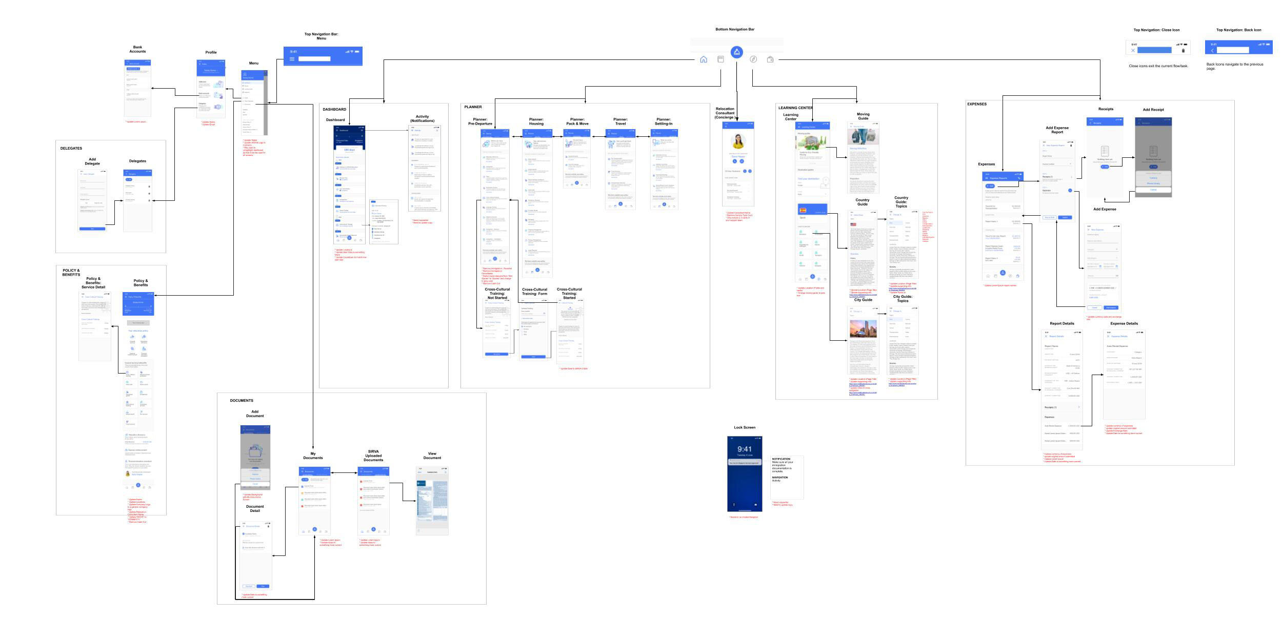
Now that we had established what we were building and its key features, it was time to look at the application as a whole and define its information architecture. A major challenge was that users wanted a linear process to help with comprehension of the relocation, while many of the SMEs told us that steps can always happen in a different order depending on the situation. Knowing that each move is unique, I still wanted to establish a recommended order to consider actions for moving. Categories for major moving cornerstones were created, which allowed users to browse freely, but later I introduced recommendations on what to consider next to help with the guidance aspect and in order to not overwhelm users. To illustrate this concept I created a flow.

Wireframes
I created the wireframes that served as the experience foundation of the project, closely working with the product owner and lead developer to collaborate on what was achievable and what would be beyond scope. Because of the stress and complexity relocating bears, it was imperative that the UI, interactions, and later, the design, were simplistic and approachable. I wanted to allow the user to be able to understand where they were in the process and break things down into chunks that would not become overwhelming.
Applying Principles to the Experience
Guidance

We introduced users to a list of tasks that needed to be completed, but also gave them recommendations on what to do next. Rather than seeing a multitude of items, narrowing it to a couple helped seem more manageable.
Transparency

To solve this pain point, I leveraged company facing data points and selected ones that would be helpful for a user with new terminology. Another area was showing the user’s policy benefits in an organized and easy instead of the traditional PDF that used to be tens of pages.
Education

One section served as a hub of information that could be accessed at any time to find more information on the process. However, I also included links to the educational content throughout the app. There was a higher chance of interest if the information was displayed contextually when the user was in a similar mind set.
Testing
After creating the first round of wires and designs, our next step was user testing. I created a high fidelity interactive prototype in Axure that allowed users to freely explore the application. The first set of testing was done with relocation experts to see if any important information was missing or misleading. One important feature we found that needed to be addressed was temporary housing since it served as an important in-between from moving to finding a new location to live. We also later performed a usability test with users that where we learned what areas resonated well.

Iteration
With the various research method inputs, I created a repository of all the features and improvements linked with the supporting research. This along with business needs would serve as a tool to create the next roadmap to plan further releases as well as the next iteration of the app.
Some of the final design

Get in Touch
Have a question or just want a chat? Please send a message if you’d like to work with me or want to learn more about me or my work.