
Ecommerce Strategy
Challenge
A music accessory company was looking to start a digital first outlook for their ecommerce strategy. They needed guidance in defining a strategy for their digital ecosystem to succeed. The B2B site would be the first selected to migrate to a new platform with a redesign to pave the path forward.
Deliverables
Workshop Synthesis
UX Audit
Information Architecture
Wireframes
High Fidelity Prototype
Interaction Design
Usability Test
Test Report

Discovery & Definition
The first step was to take a deeper dive into the company’s goals and current state. We conducted a workshop to learn more about the company. One of the exercises we did was having stakeholders write down their hopes for company’s digital transformation and what type of obstacles they saw as being potential blockers to make progress. After the workshop I took all the input gathered and synthesized it into patterns and categories to inform the strategy. From there the team created a roadmap for the strategy of the next five years. The first priority was to migrate and update the B2B ecommerce website.


Audit & Prioritization
From there I conducted a user experience audit of the existing B2B site while the developer team audited the current systems. This helped gain a holistic understanding of where the site was at and the level of effort for improvements that needed to be made.
After that I prioritized and labeled recommendations with a data visualization to help gain a better understanding of patterns and where certain effort were.
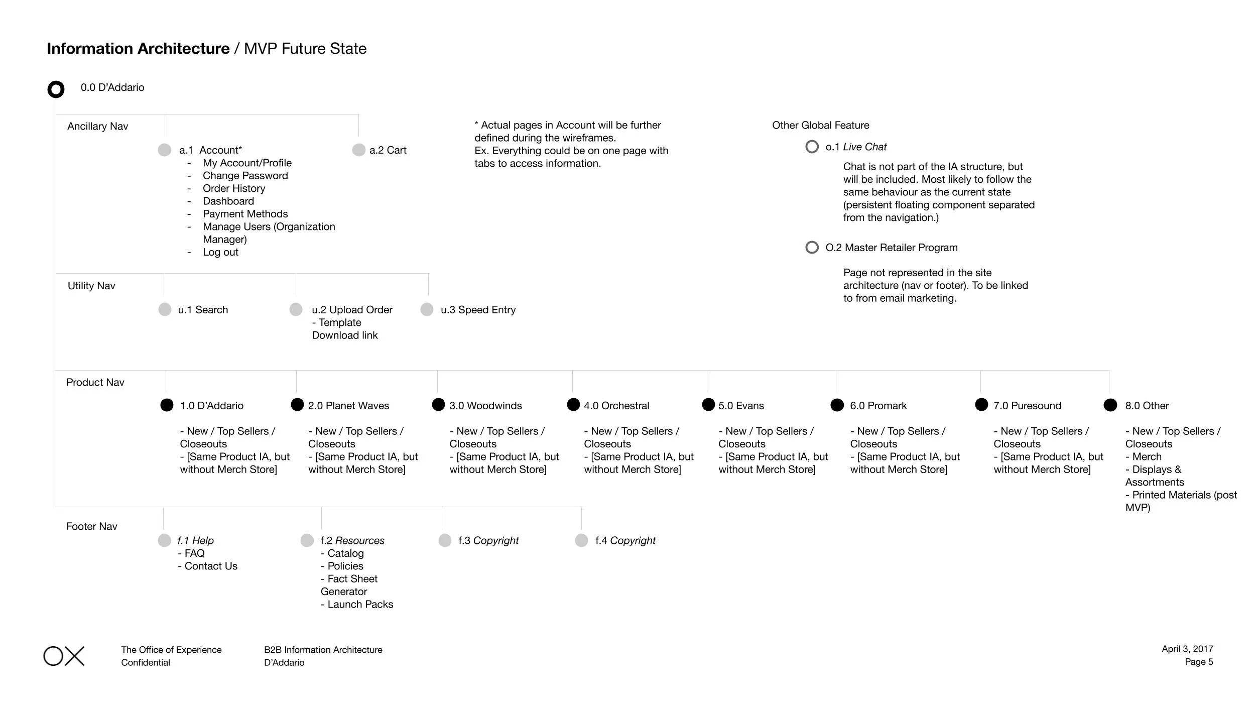
Site Strategy & Concept
Before jumping into detailed wireframes, I designed the new information architecture for the website and documented the ecosystem architecture while the team put together a high level flow of the different pages. This helped to gather more detailed requirements for each page template and served as a baseline for the more detailed wireframes.

Wireframes
Next I created detailed wireframes, closely working with the developers to understand the system limitations for launch. This helped to have a better understanding of the requirements before getting too far into the details of the wireframes as well as figuring out edge cases. This led to a more aligned approached when presenting to the client and developing the site.

For the homepage, we wanted to focus on more task oriented content since B2B users were often coming to reorder materials or check the status. Many users would often upload a spreadsheet of what they needed to order.

For B2B users it was important to design for the common use case of searching for a SKU rather than descriptive terms or products like a B2C user may do.

I captured various states of promotions in the cart for development to reference. Additionally, we also included a promotional block below the cart to both help users recall an item they may have forgotten and to increase average order value.

Prototyping & Testing
The designers then created higher fidelity mock ups for testing. This would help to get more realistic reactions to placement and hierarchy of information throughout the site. With the designed pages, I hooked together a prototype and wrote the usability test plan. We were hoping to find any large points of friction before going into development.
With the test, we discovered a couple of areas to improve. One area was search, that it should be even more prominent and be sure to account for different variability in SKU searches like hyphens.
Some of the final designs


Get in Touch
Have a question or just want a chat? Please send a message if you’d like to work with me or want to learn more about me or my work.